Before beginning the redesign, I focused on the background of the brand. KPMG has four main areas of focus and four founders, yet the firm is losing market share to the other three “Big Four” firms. This may be due to their perceived lack of independence and adventurousness, which gives the firm a stiff, less innovative image.
I wanted to emphasize the motif of four as a keystone of the brand. The existing color palette felt two-dimensional, so I explored ways to make it more complex while keeping it simple enough for consistent application across all touchpoints. To visualize my ideas, I created the animation below:

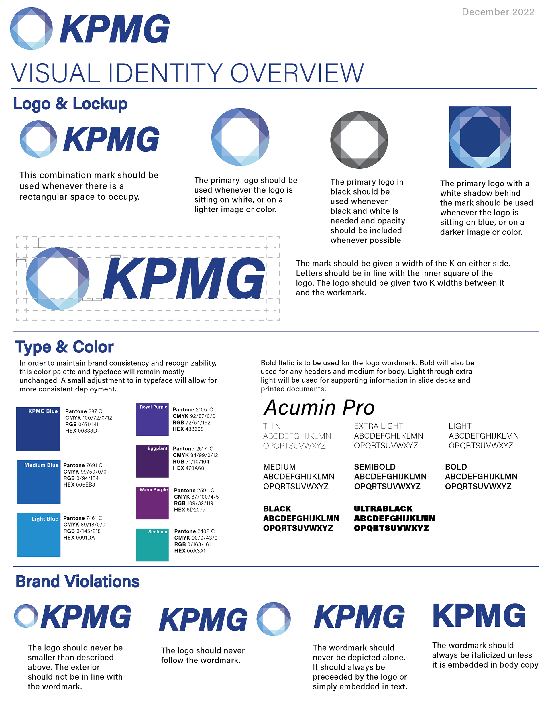
Below is my final mark, which encapsulates all four elements of the brand using an updated color palette:


I also created a brand guide in order to make sure that the redesigned elements are used properly and consistently with the rest of the brand's identity. The one-page brand guidelines are shown below:
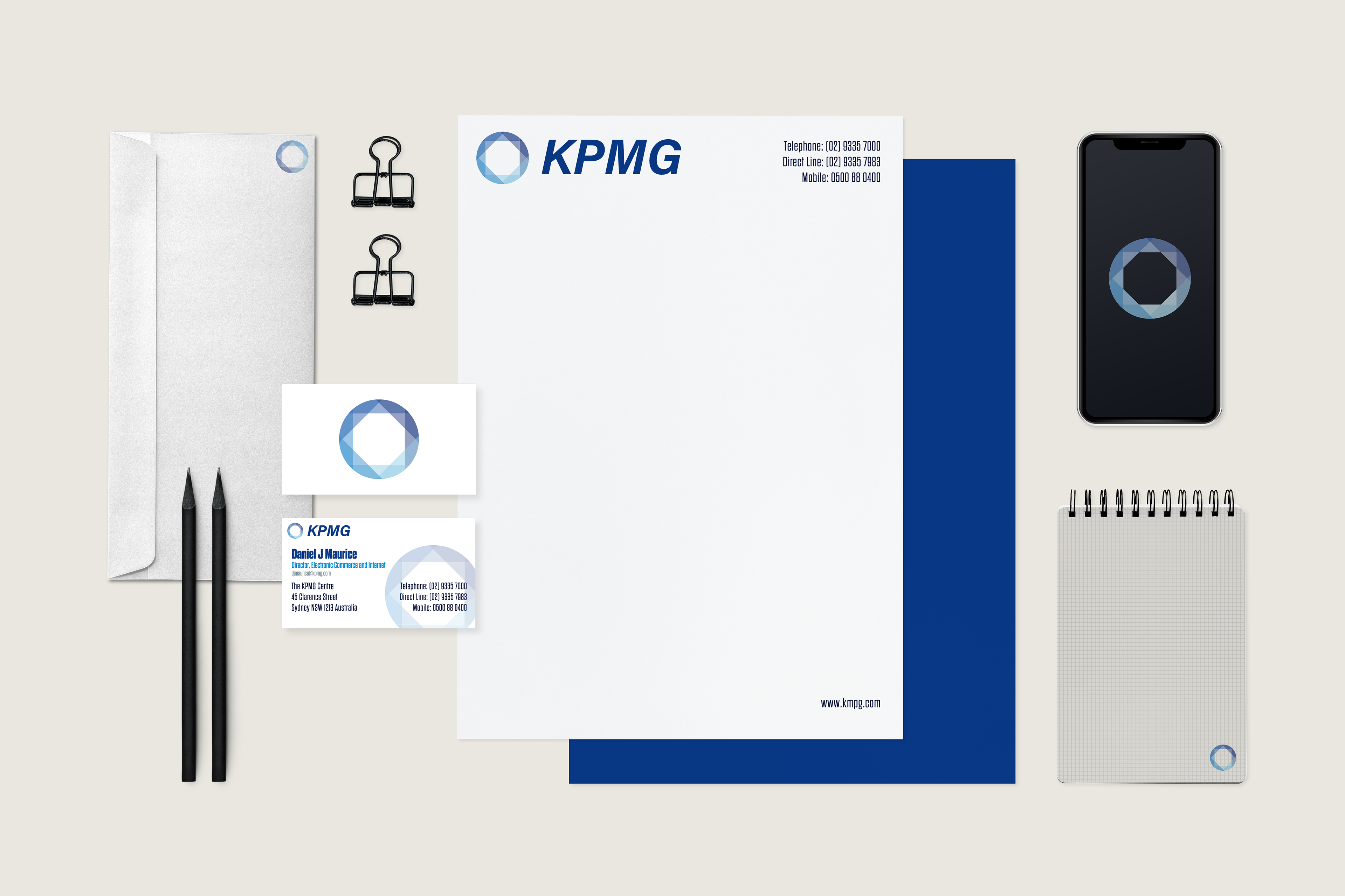
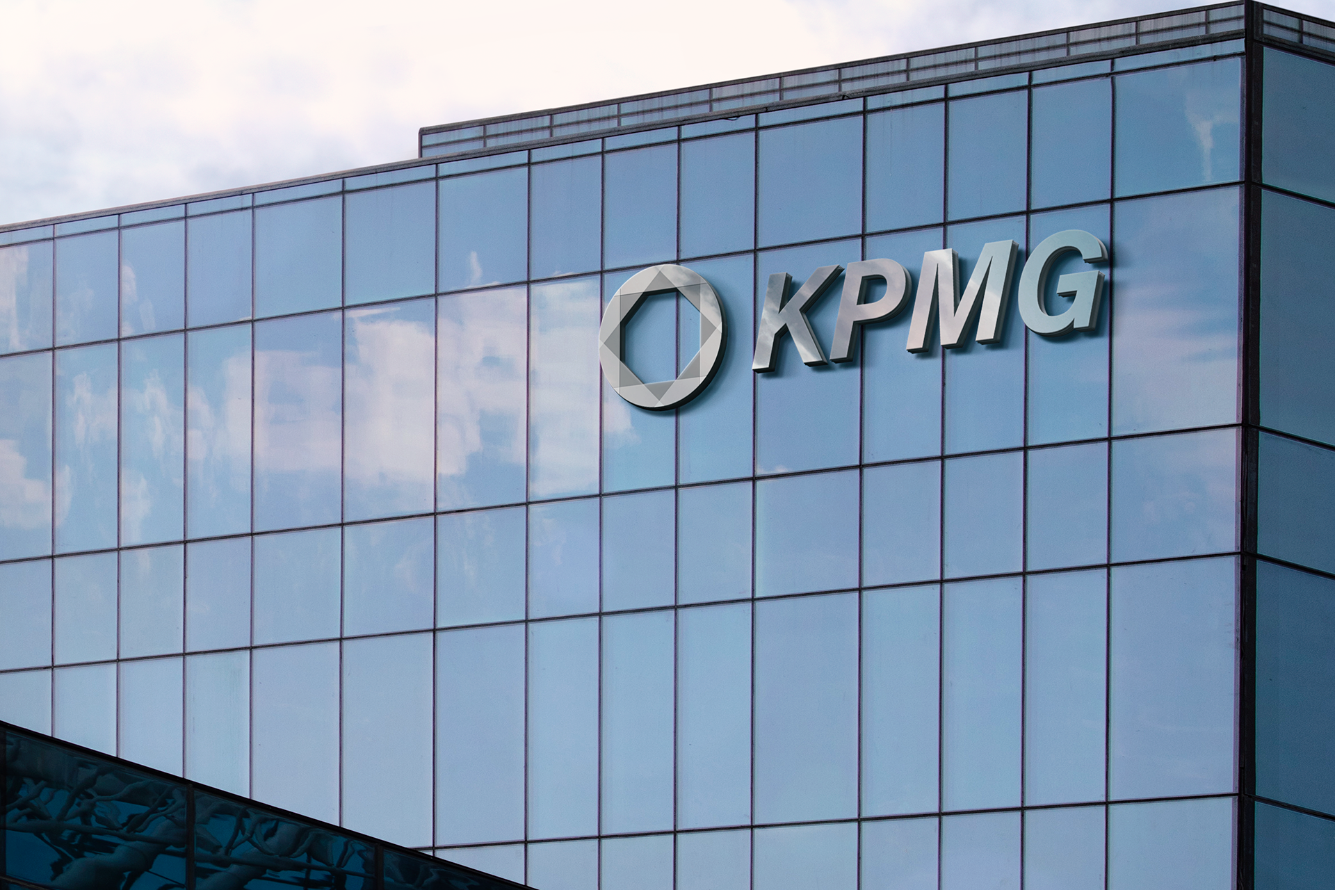
Finally, I created mockups of the new identity showing how employees will interact with it on a daily basis. This step allows me to really get a feel for what the rebrand will feel like once it is physically tangible.