

Western photographer Luke Reynolds began gaining real momentum, landing a few notable clients without having any brand foundation to support his growth. He had no distinguishable brand components, and nothing about his visual identity reflected the quality of the work he was producing. I was hired to build a full brand from the ground up, giving him a clear, cohesive system that would provide structure as his success continues to grow.
My initial research found that industry standard for photographers is a wordmark, often in script, which could be abbreviated to a monogram-style watermark. I aimed to build something more recognizable, without losing the character that defines Luke’s photography. Below is the mood board I built to help me think through all those elements:
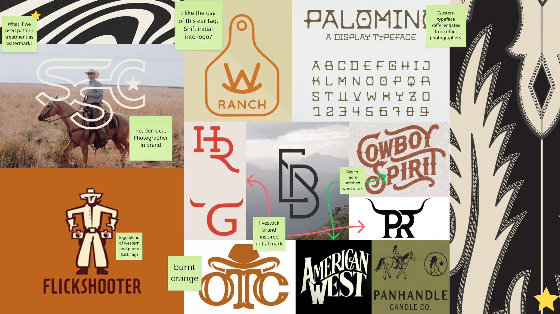
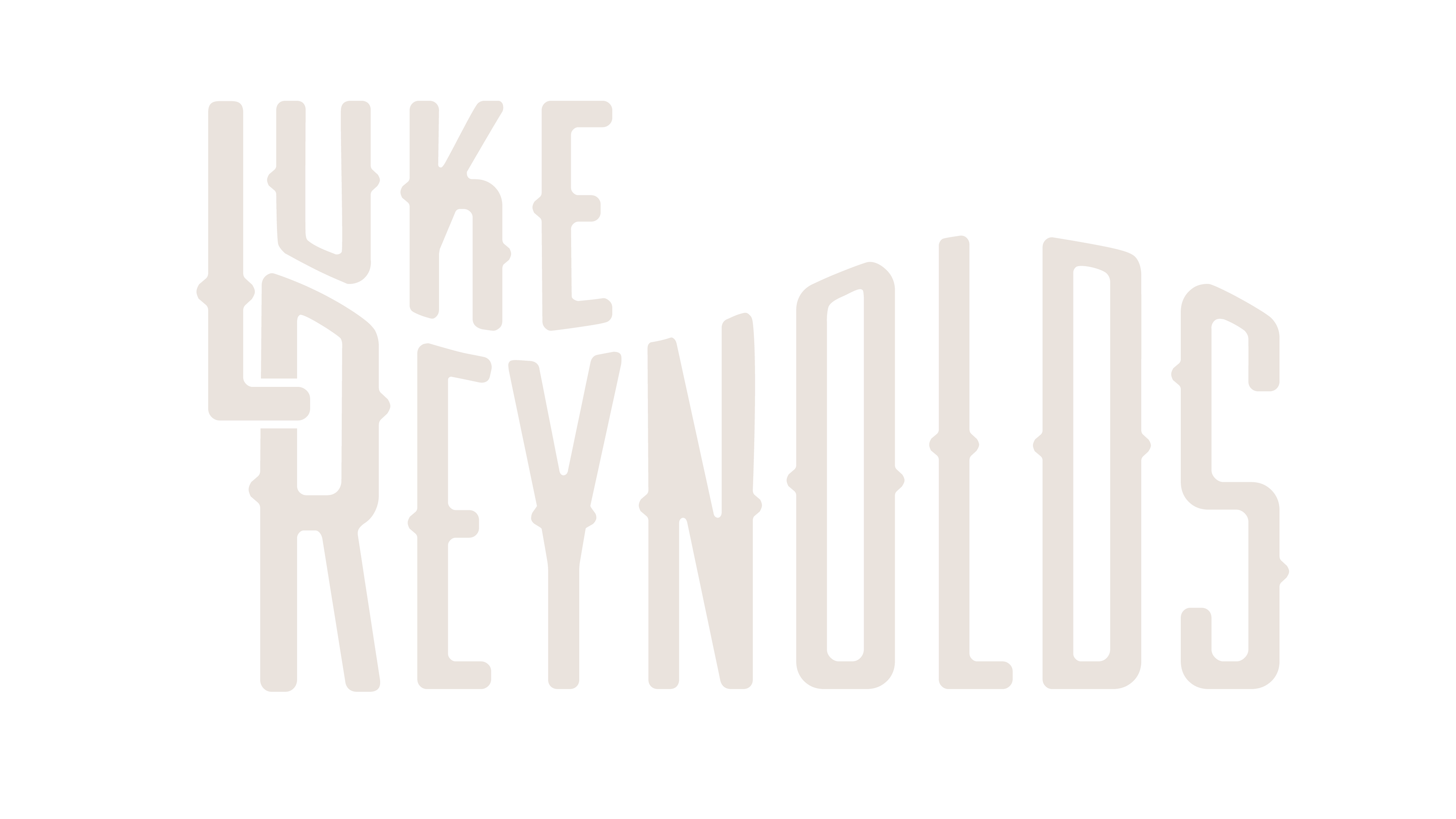
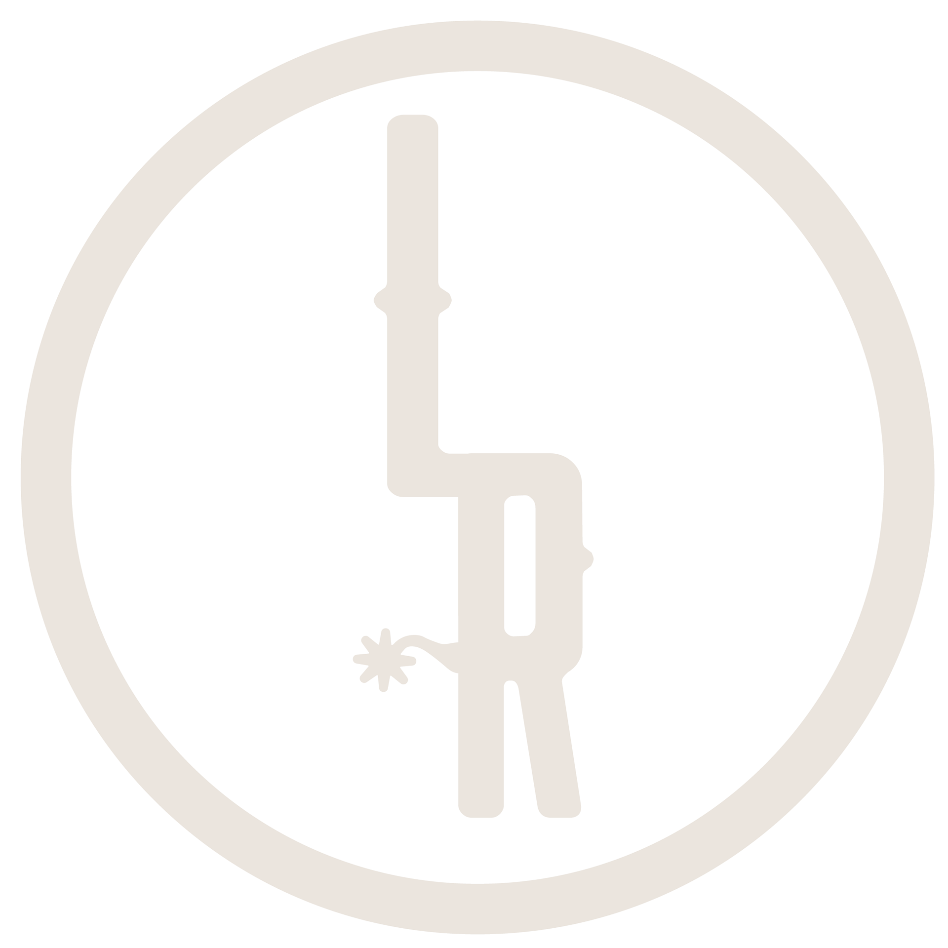
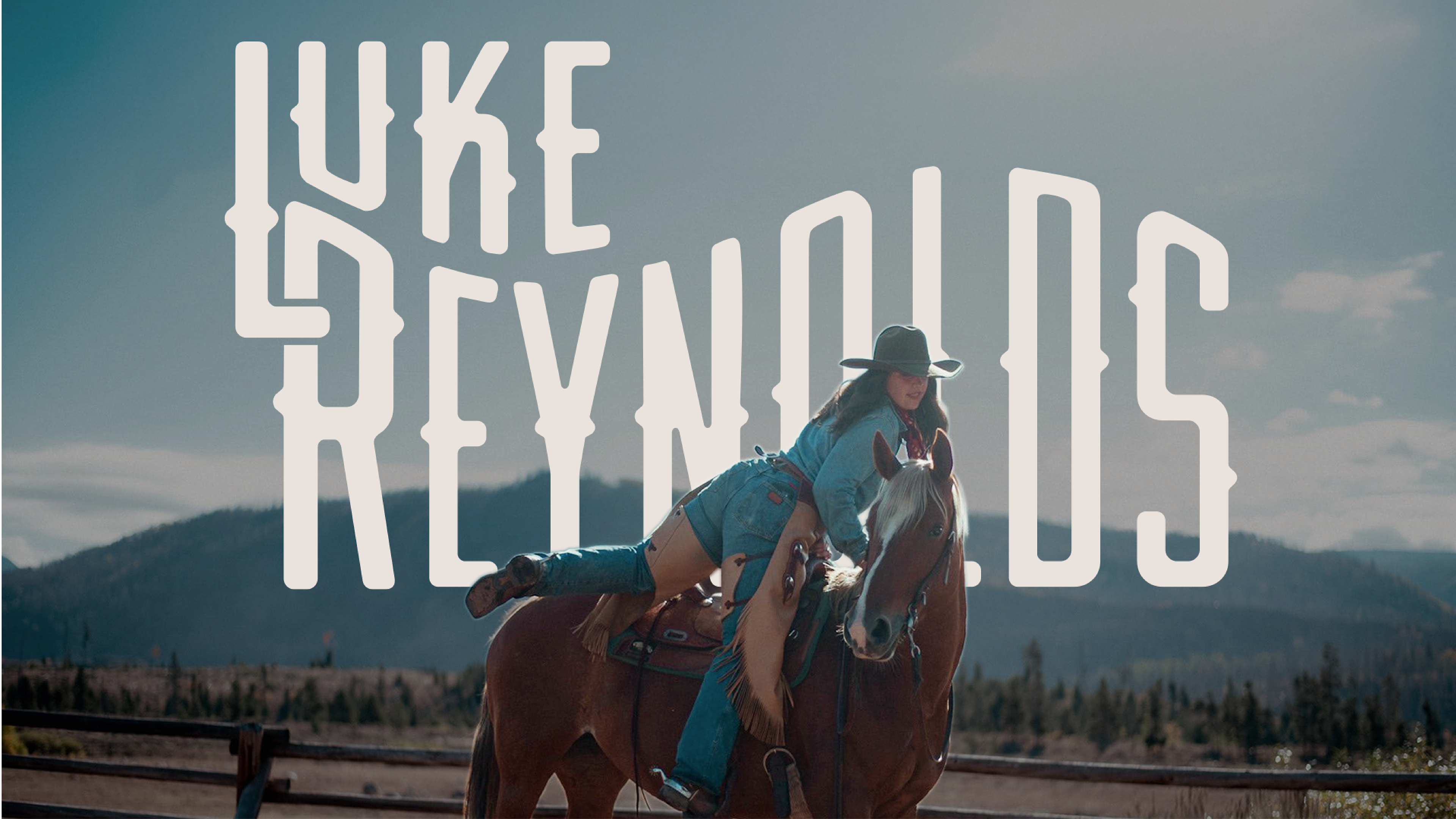
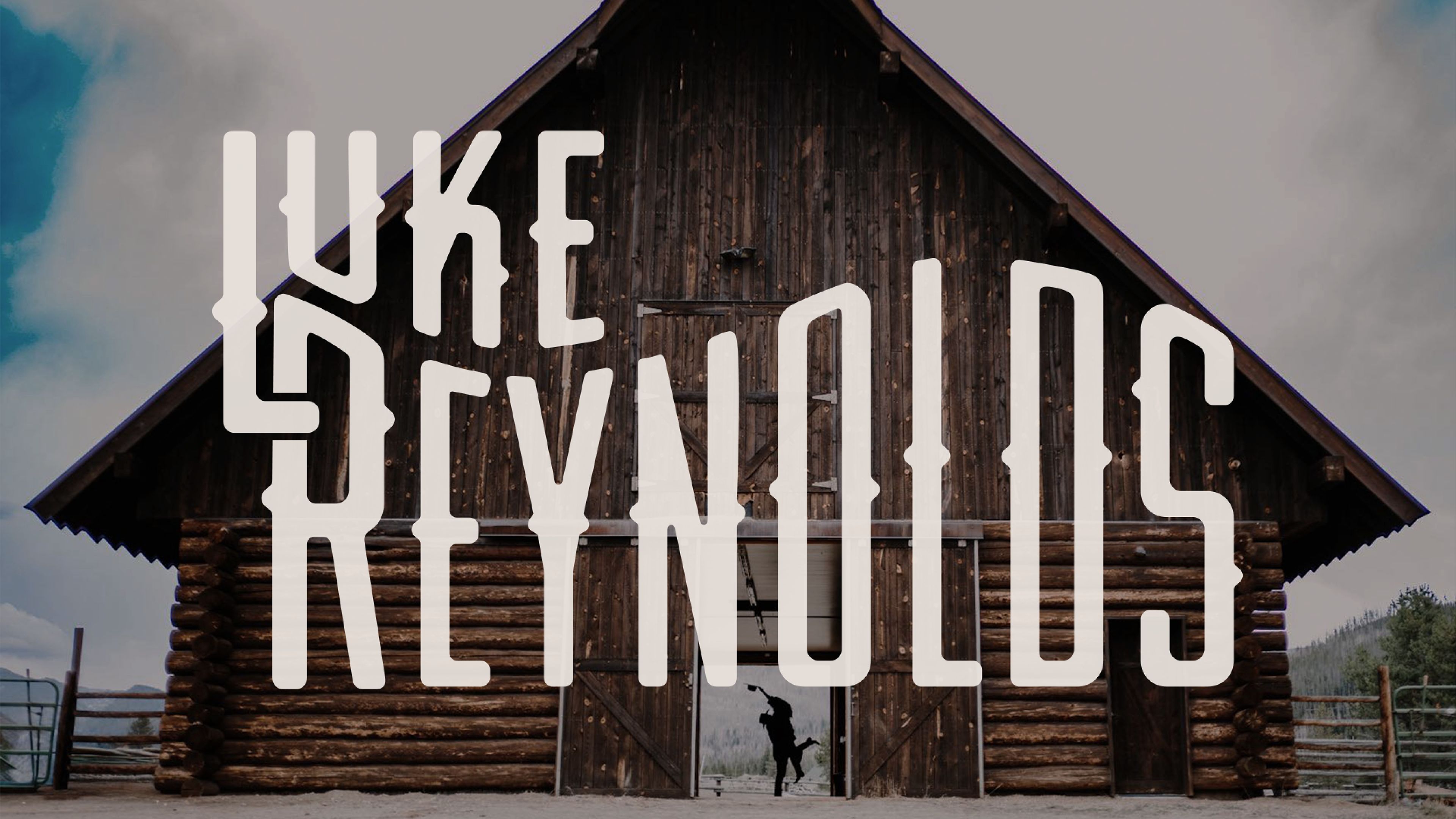
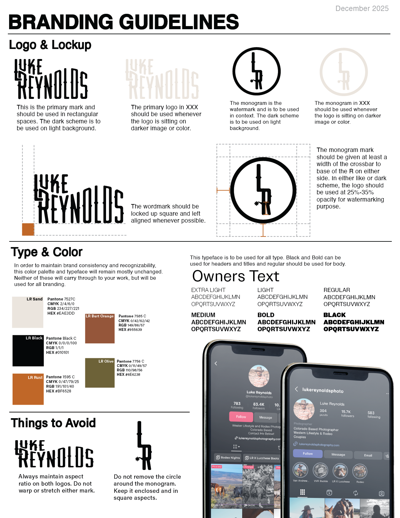
From that initial ideation, I created a primary wordmark inspired by old west Americana typefaces and logos. I also created a monogram-style watermark that carries elements of modern livestock brands.
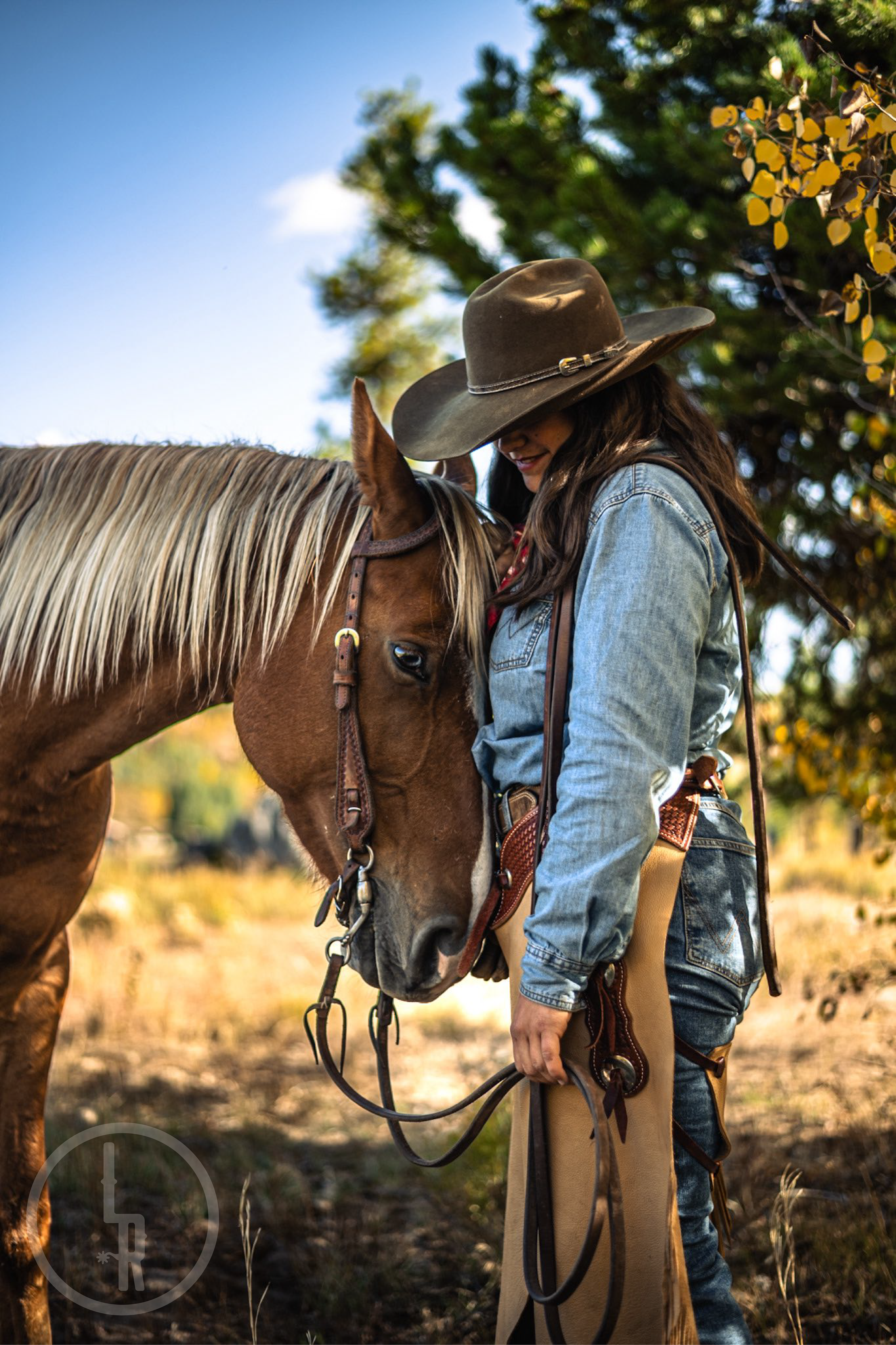
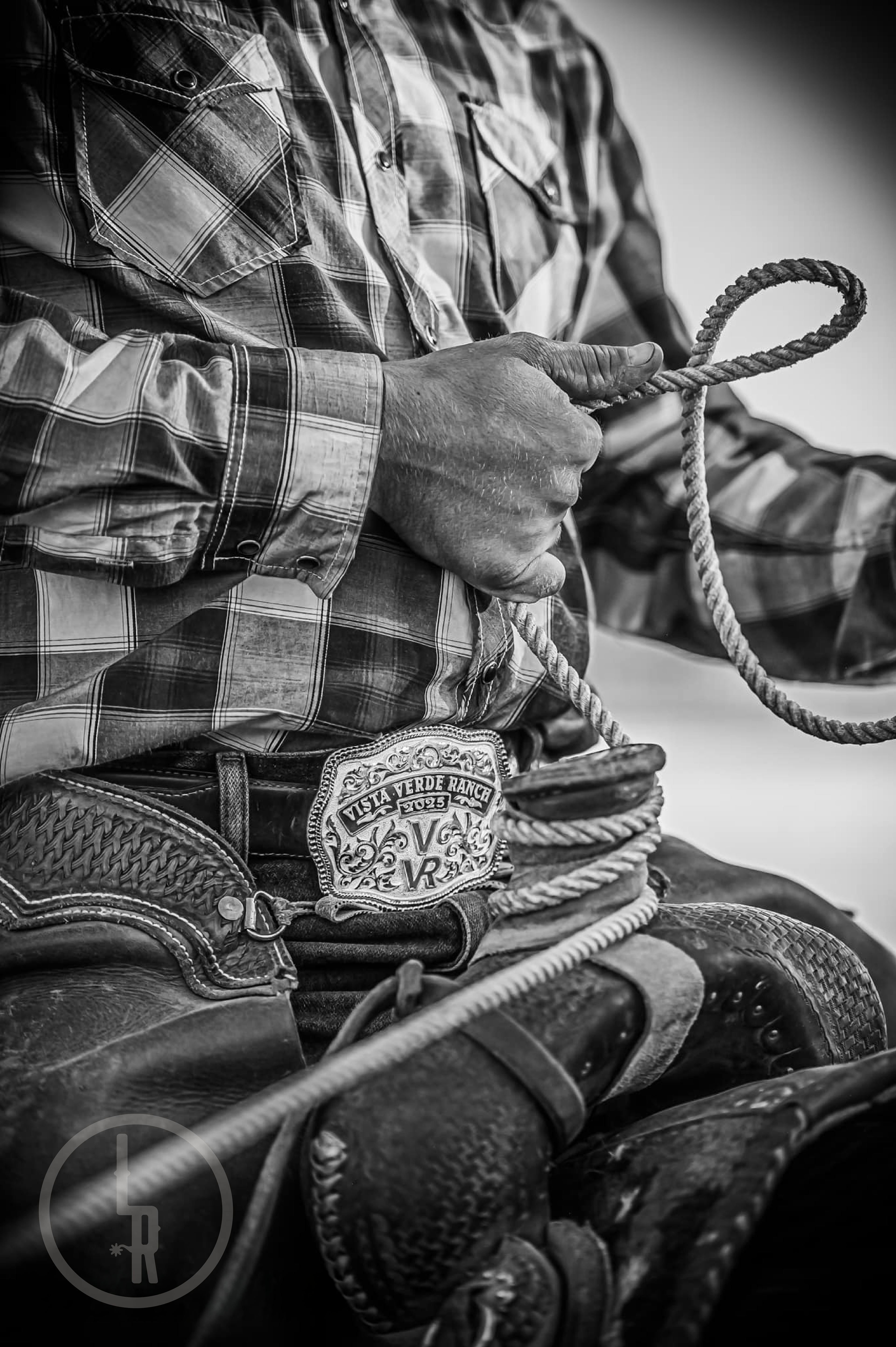
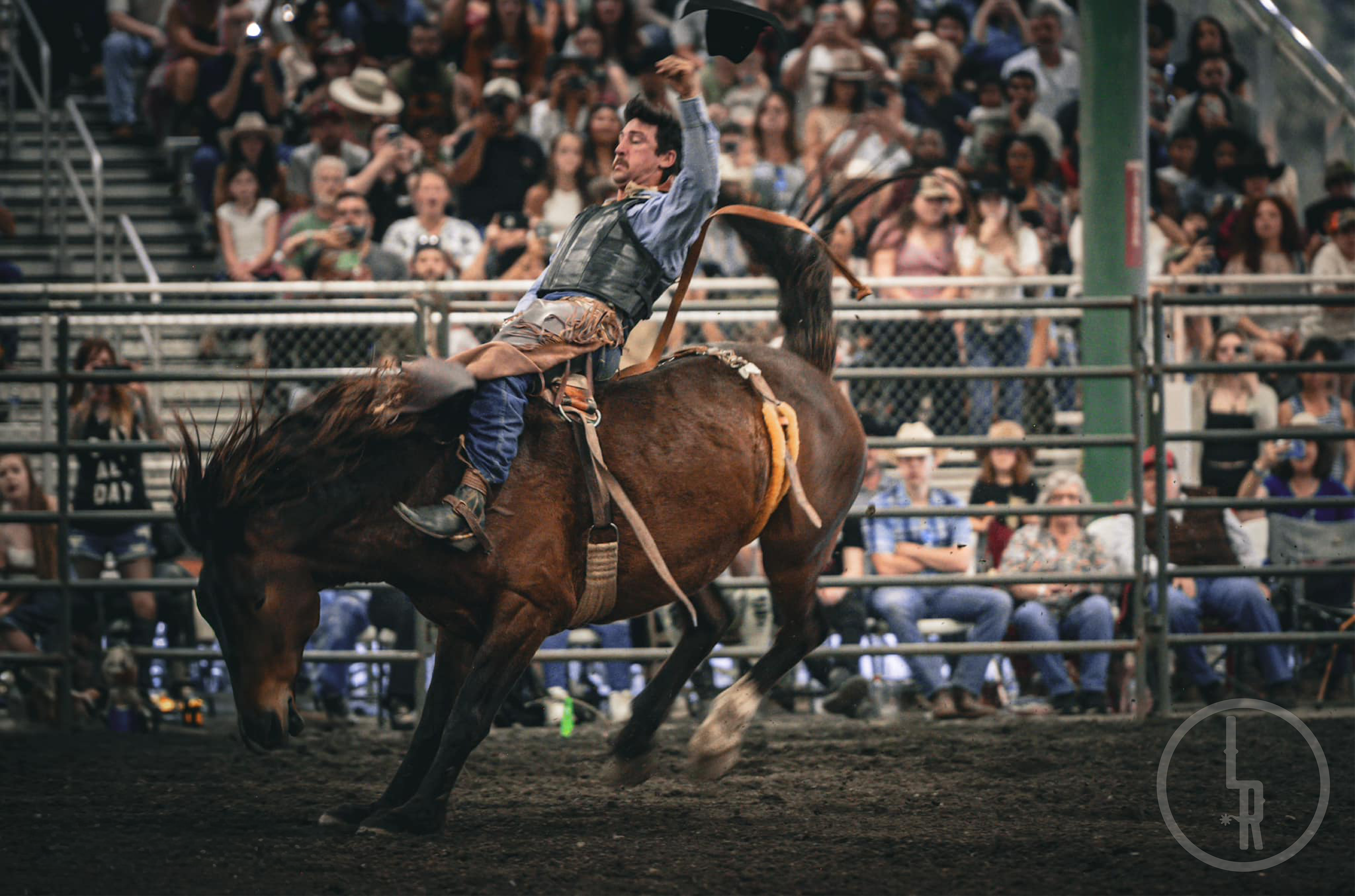
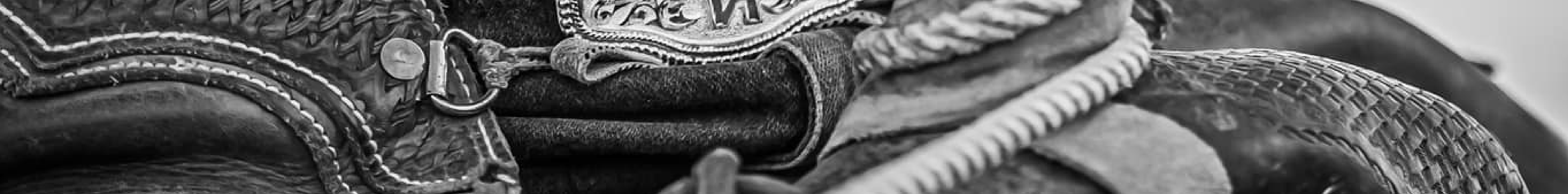
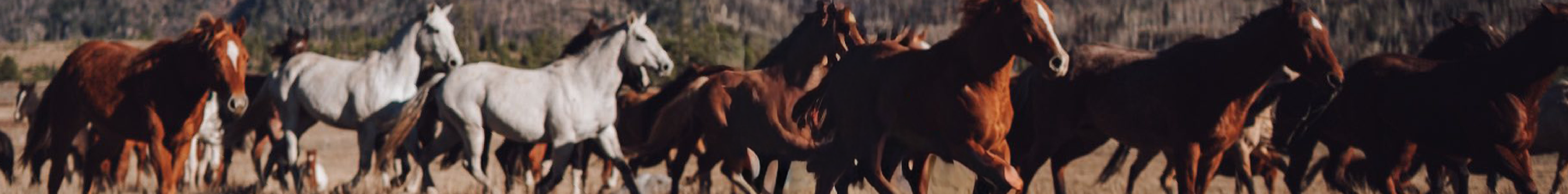
With the brand starting to take shape, I created a master assets package with everything a photographer would realistically need. It included a color palette, photo treatments utilizing the watermark, headers and footers, social mockups, and some possible splash images. The goal was to give him a complete, ready-to-use system that would keep his branding consistent across every touchpoint.


In order to make all these assets easier to use, I created a reference index as well as a one-page brand guideline to be used as a "cheat sheet".
I finished the project by building a ready-to-launch portfolio that pulled together his new branding and highlighted his skills.