As a part of a packaging design course, my partner and I created the full graphic layout, with an emphasis on packaging design, for a local tea shop’s first in-store product, a tea concentrate. We focused on bringing the calm of the tea shop that customers love to the shelves of big-box stores.
First we created a simple and strong logo for the shop that could represent the brand in or out of the shop.

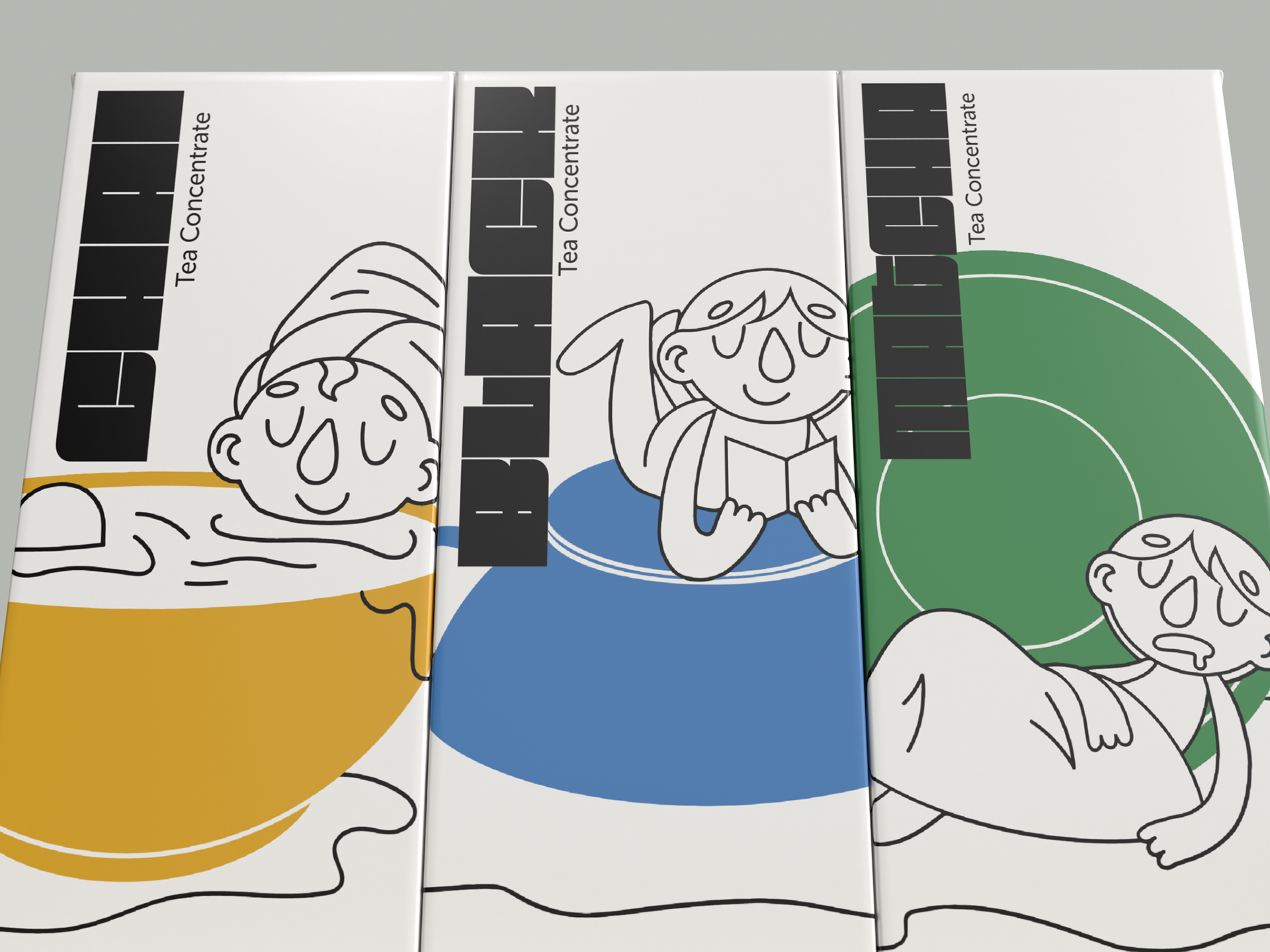
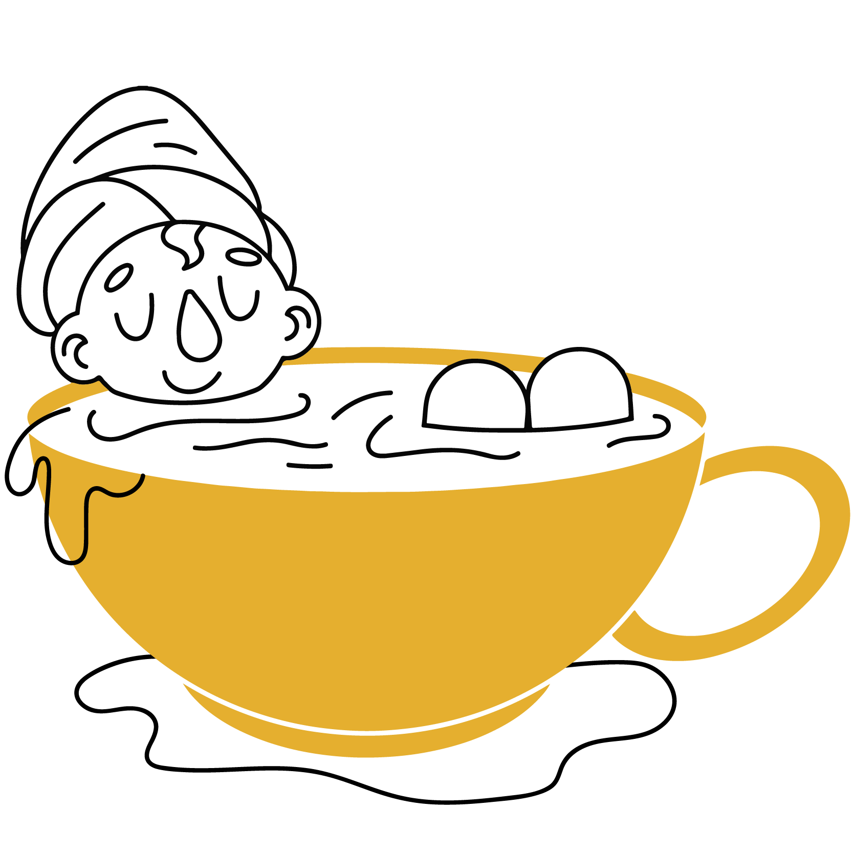
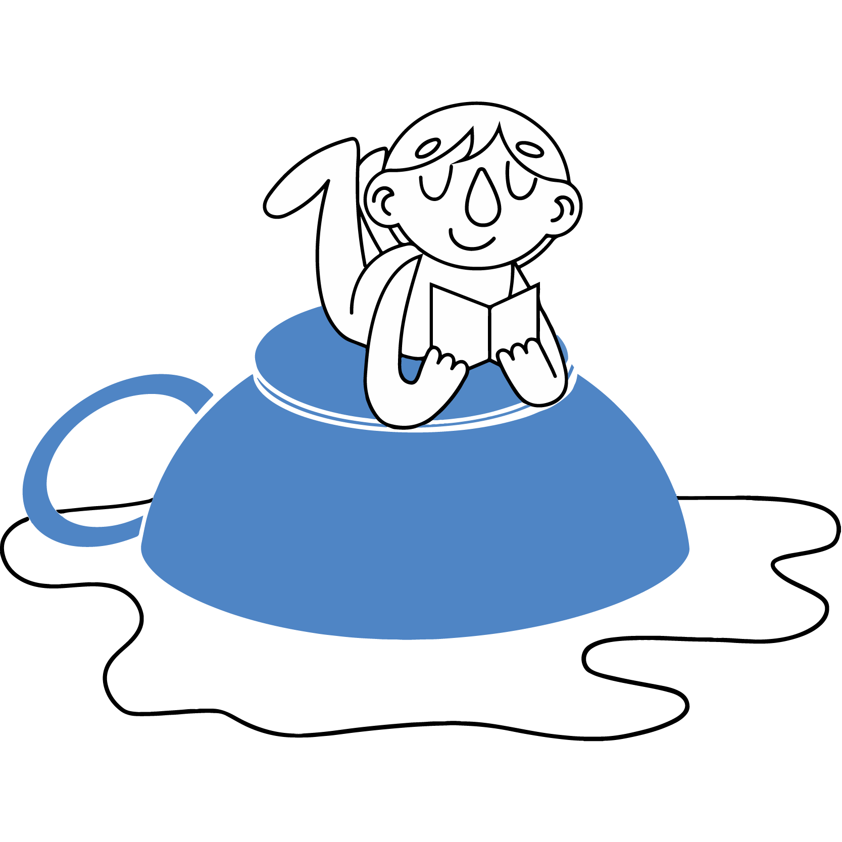
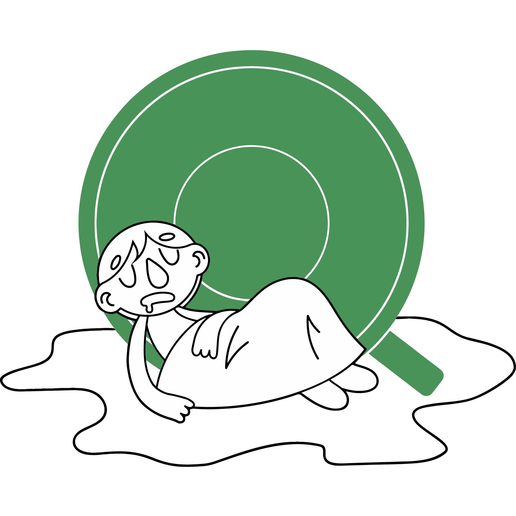
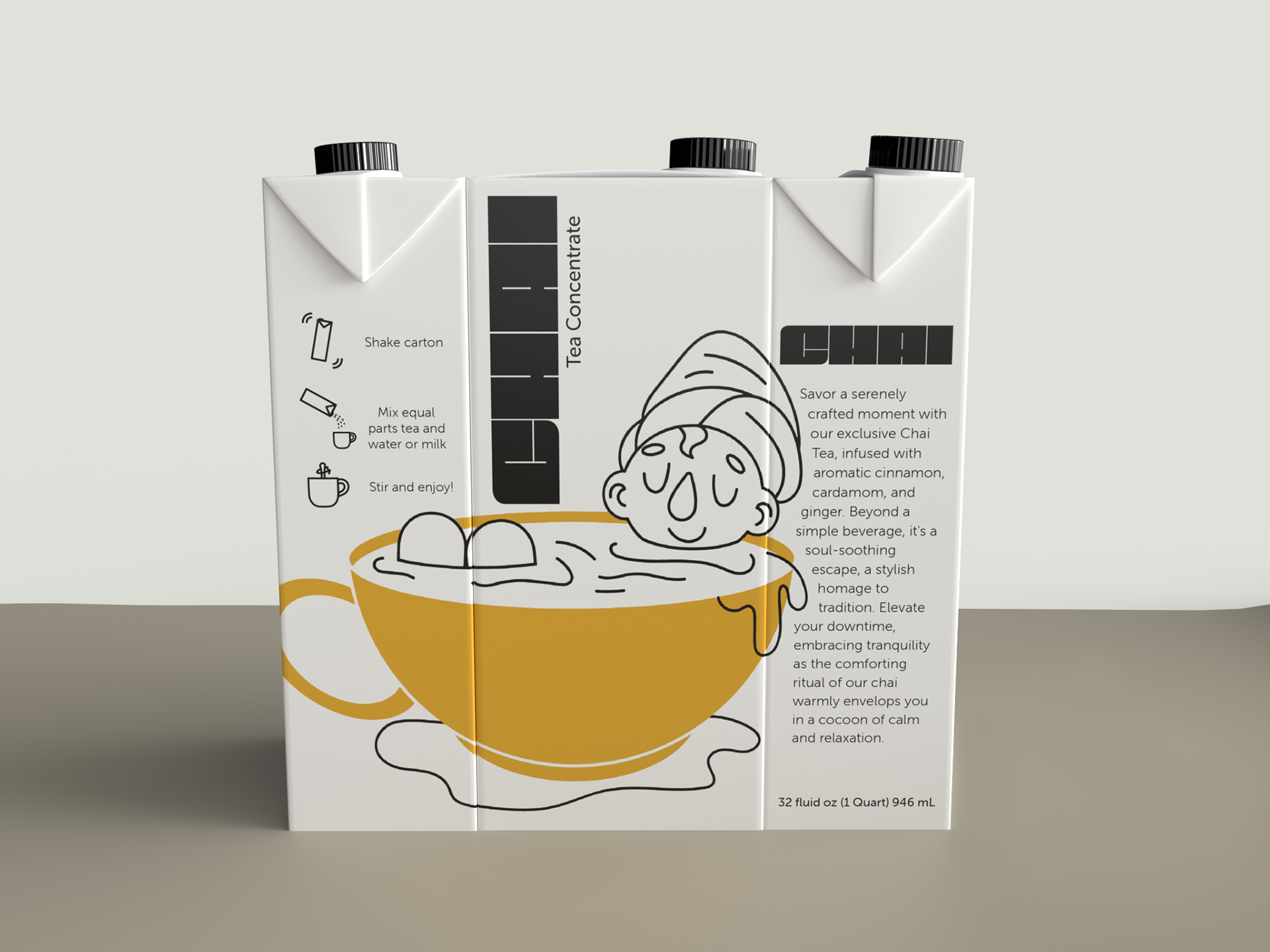
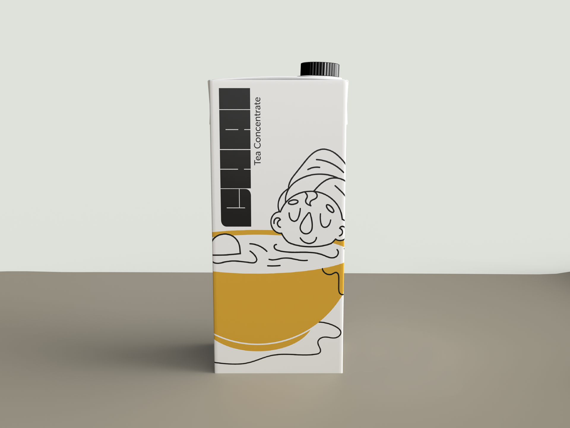
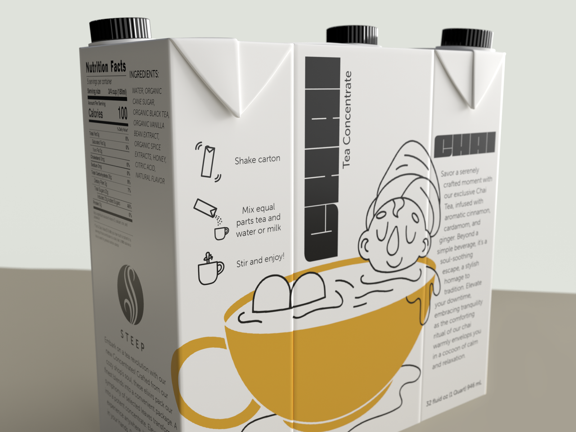
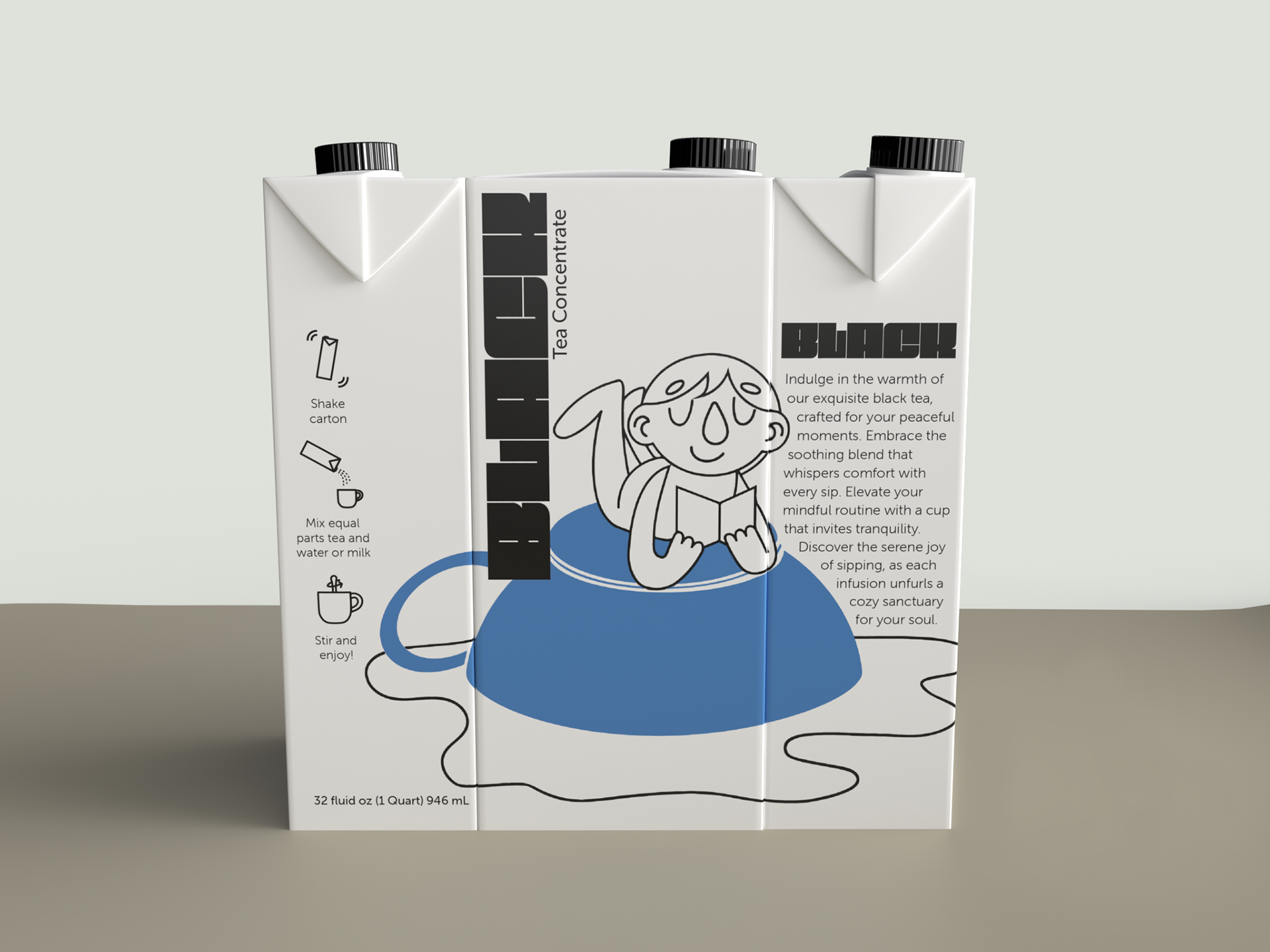
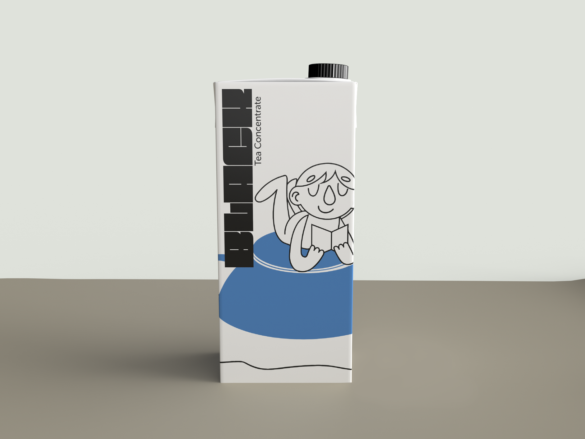
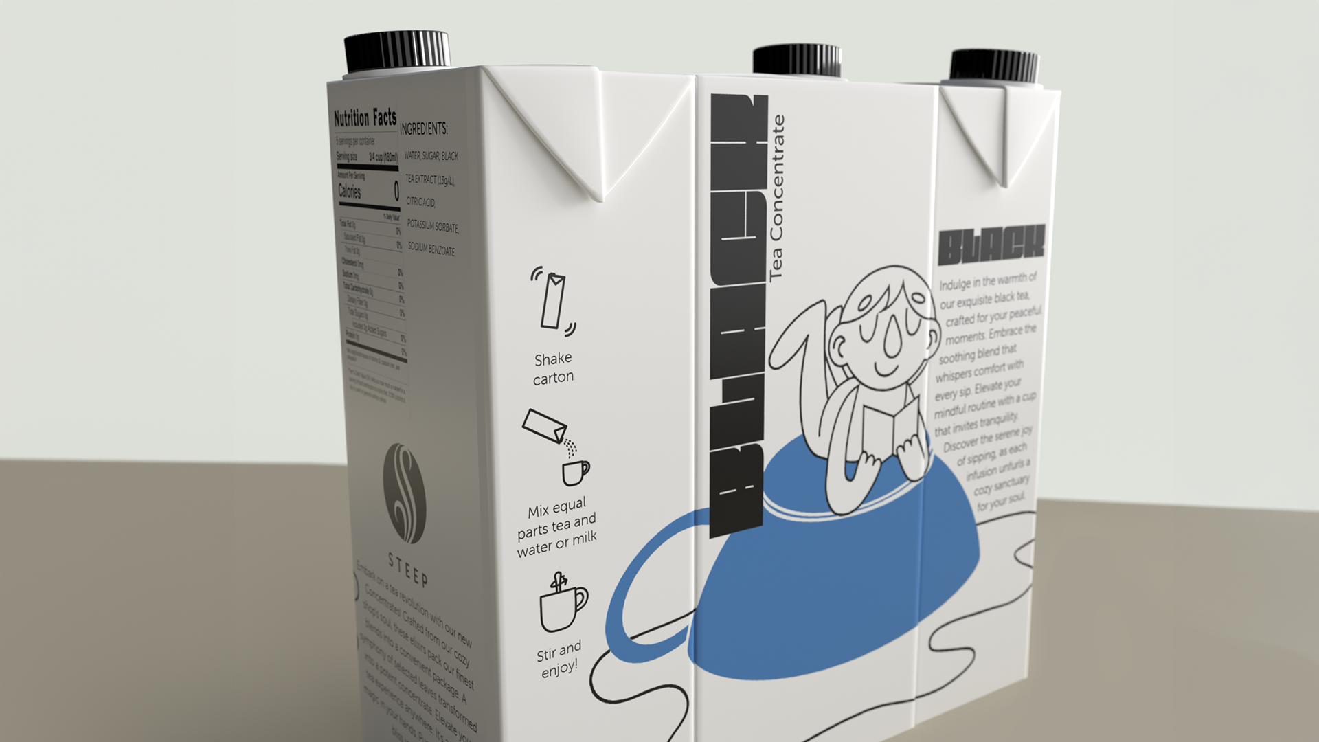
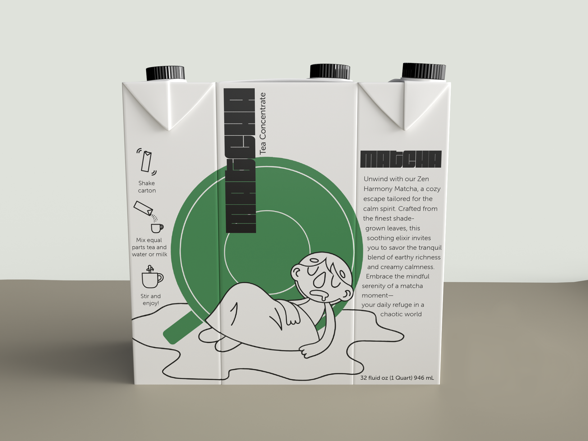
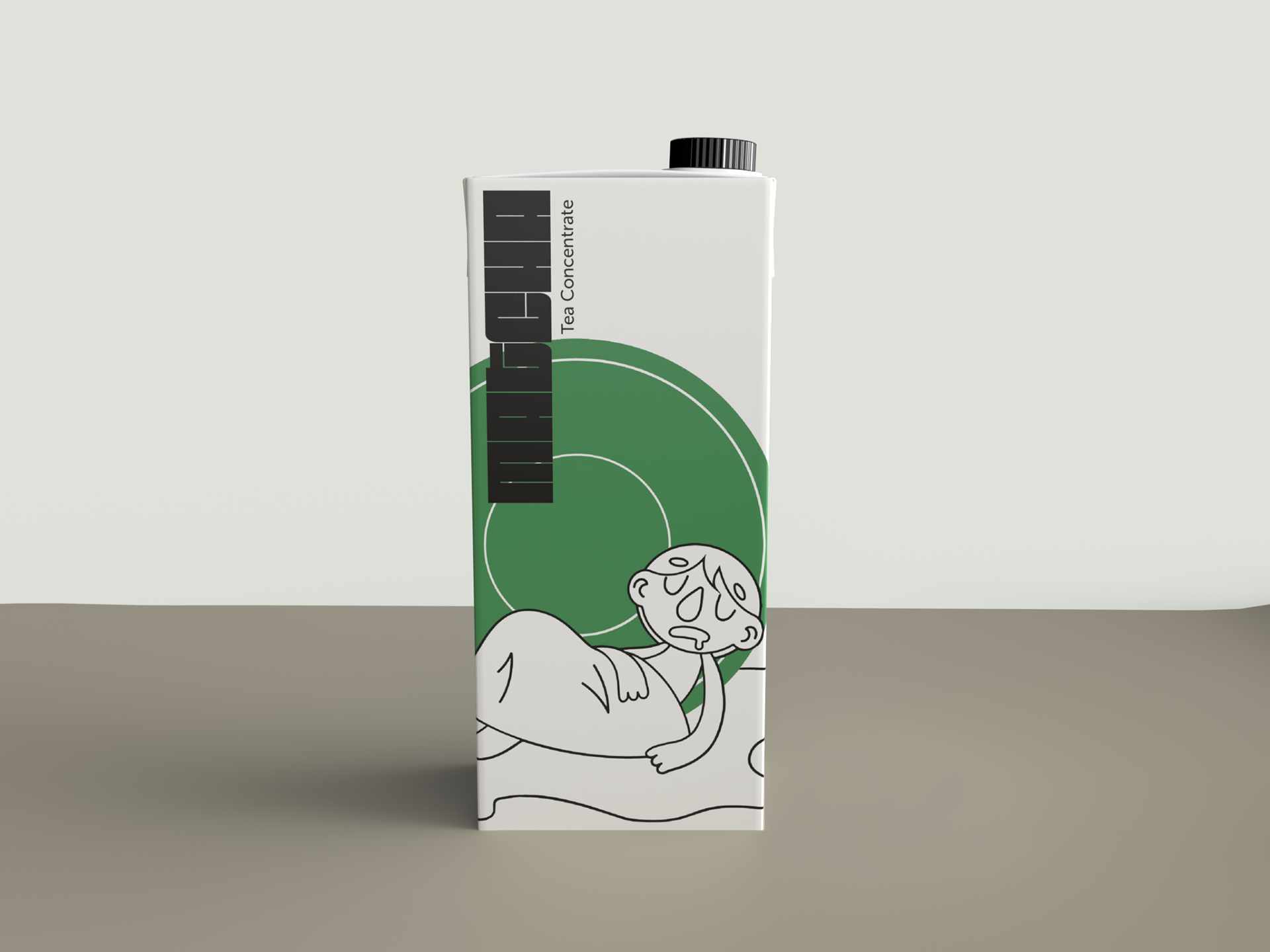
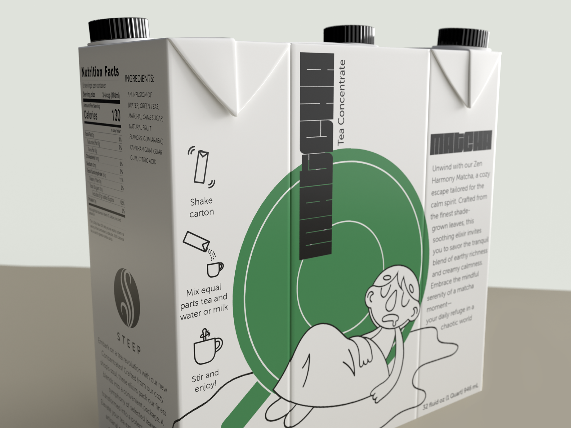
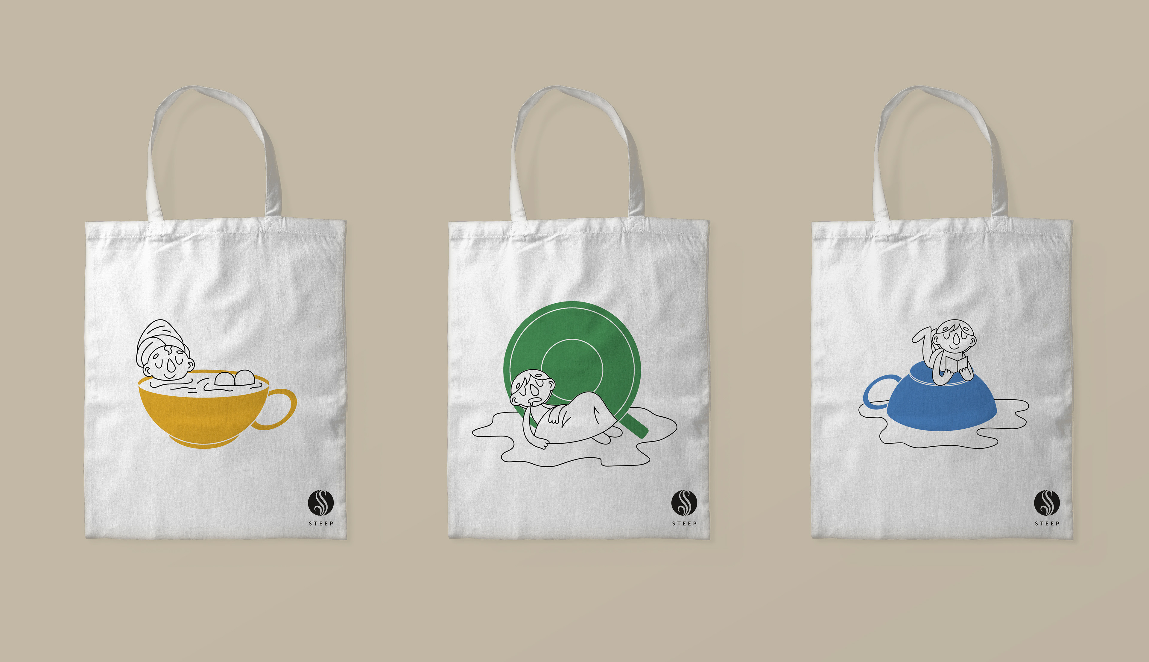
In order to translate the feeling of the shop onto superstore shelves, we created three unique personalities, one for each flavor. Each of these personalities came with their own color scheme and each engaged in their own relaxing activity.
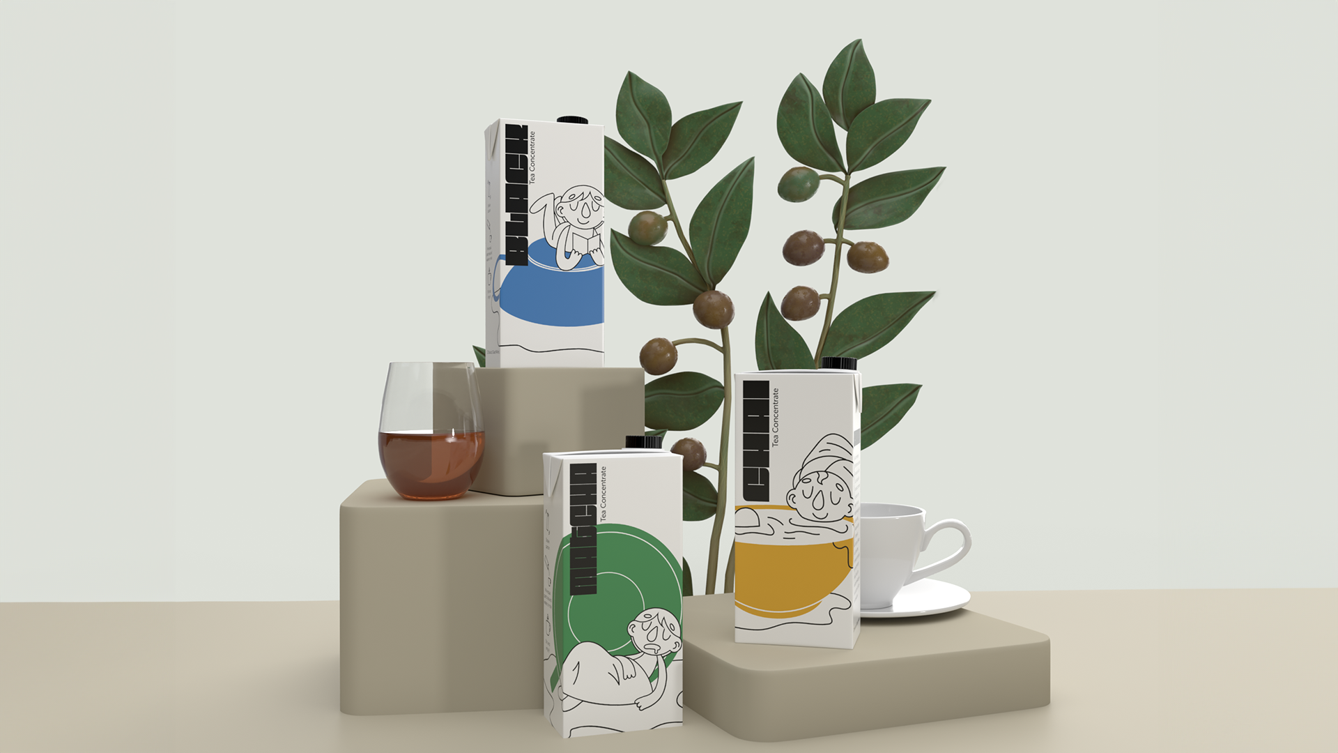
We knew that our small shop wouldn't be working with much budget, so we wanted to create a billboard effect on shelves with our packaging design. We decided to create a design that, when placed next to each other, would tell a larger story and draw in the eye of shoppers. First we created a flat layout of the entire story and how we wanted the final "billboard" to look for each persona.
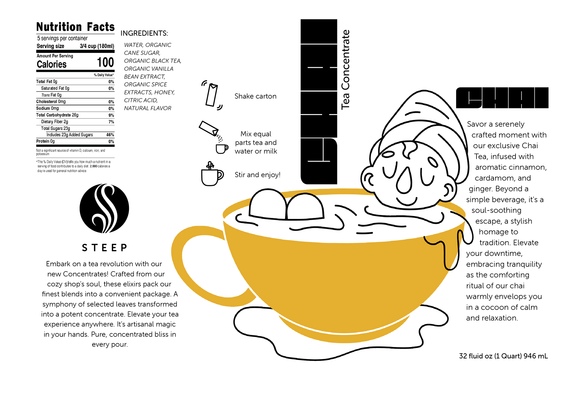
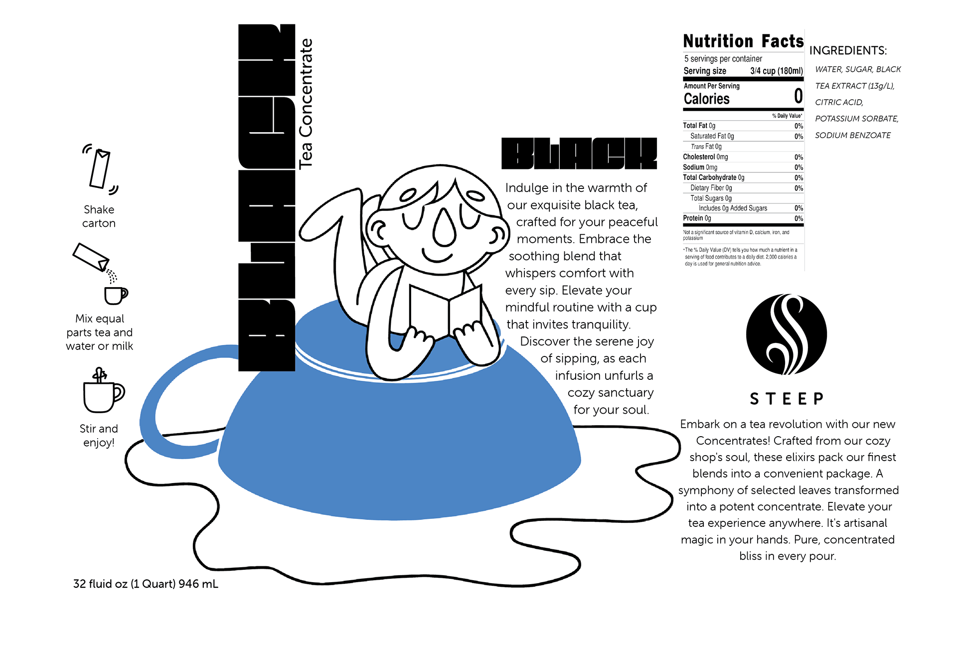
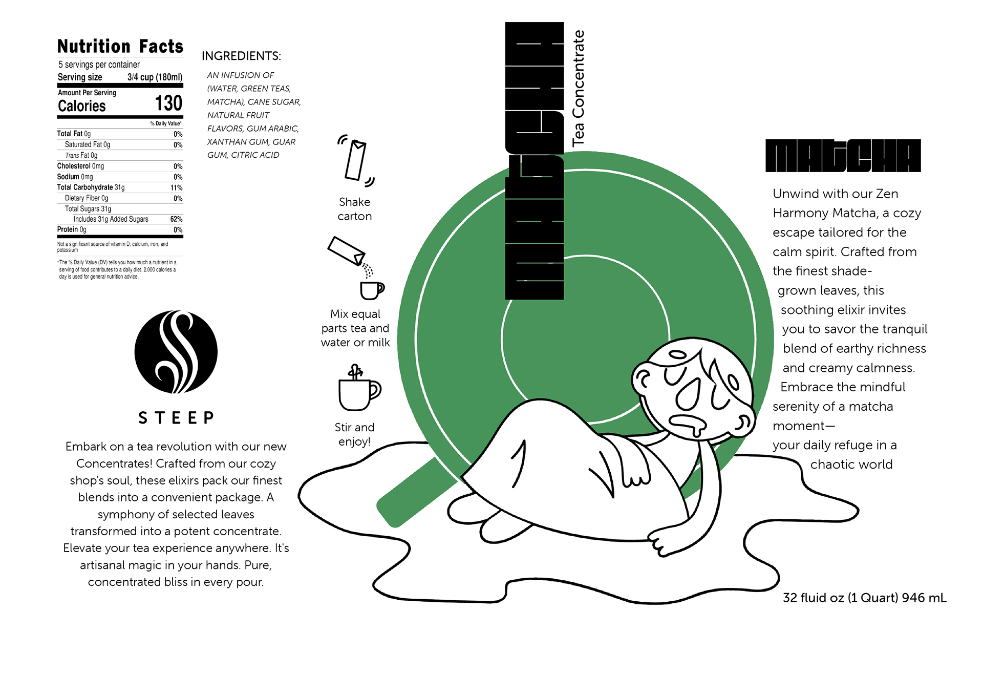
In order to keep costs down and stay as simple as possible, we created a single package that would display a different panel of our flat layout on each side. In stores, this larger image would stand out against competitors and captivate shoppers.
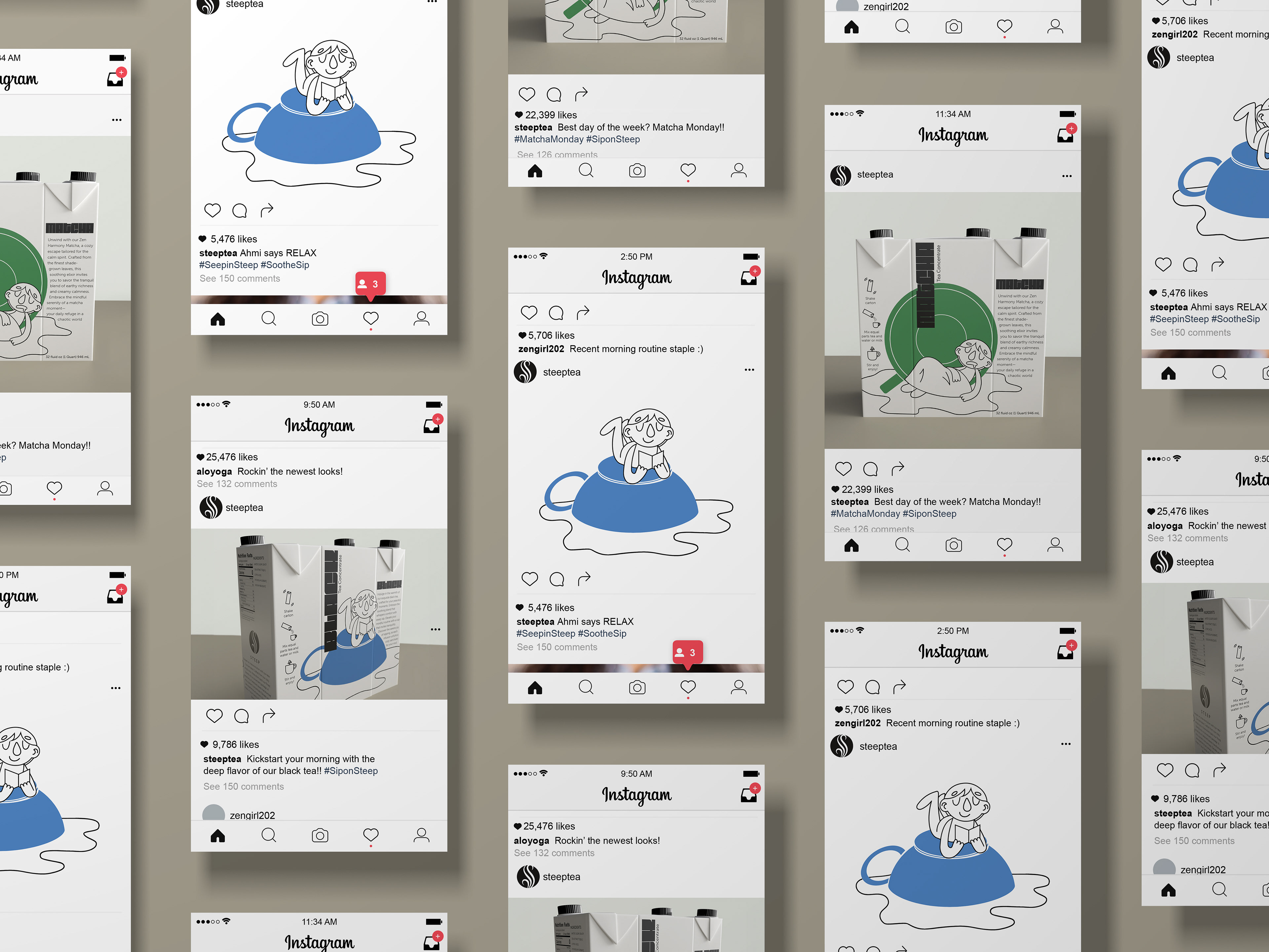
As a final touch, we demonstrated how these three new personas would boost the brand across all platforms. We wanted to make sure that they represented the brand universally, not just on store shelves.
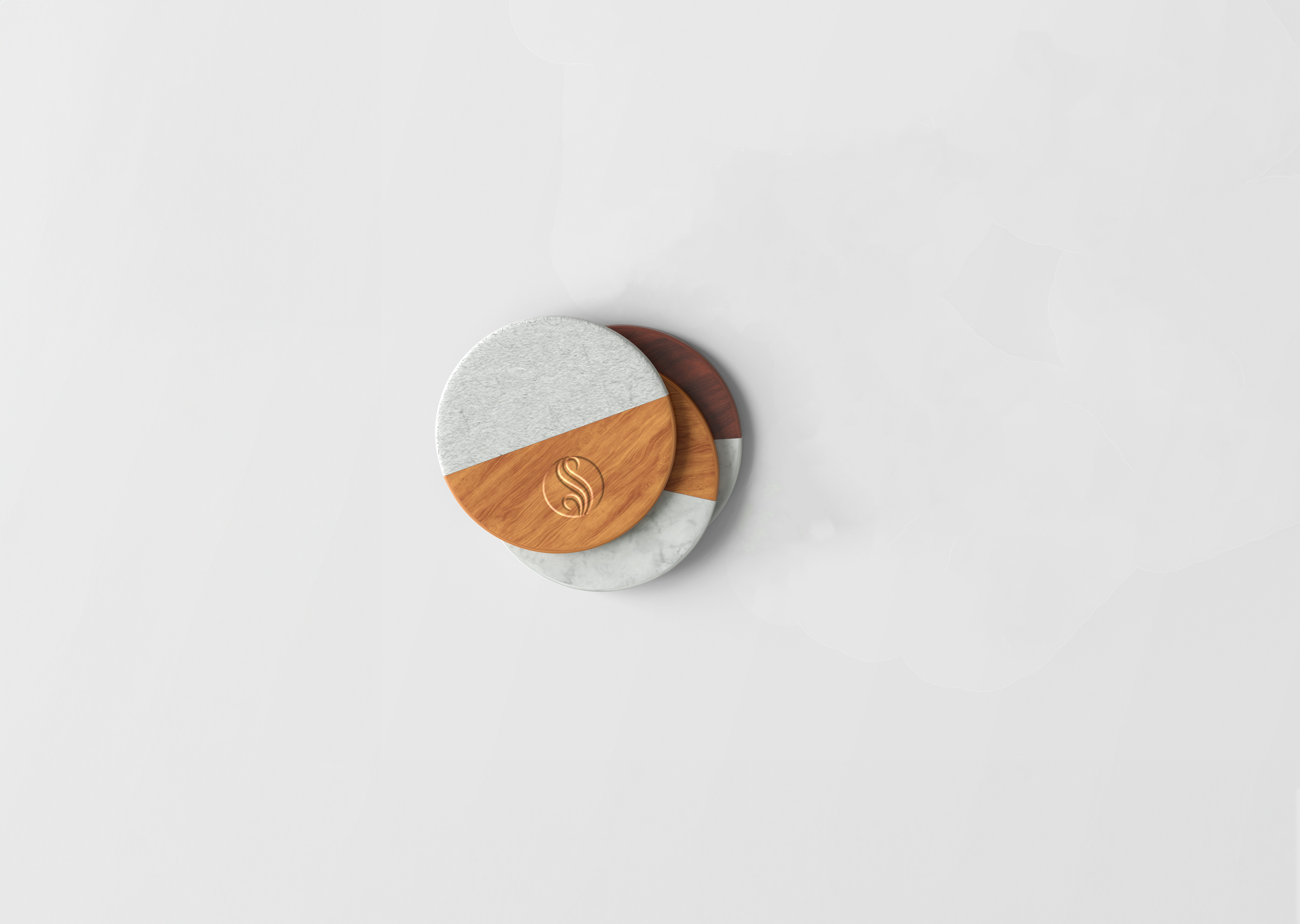
We also wanted to flex our design muscles and taught ourselves the fundamentals of 3D modeling by creating a "glamour shot" of our final designs.