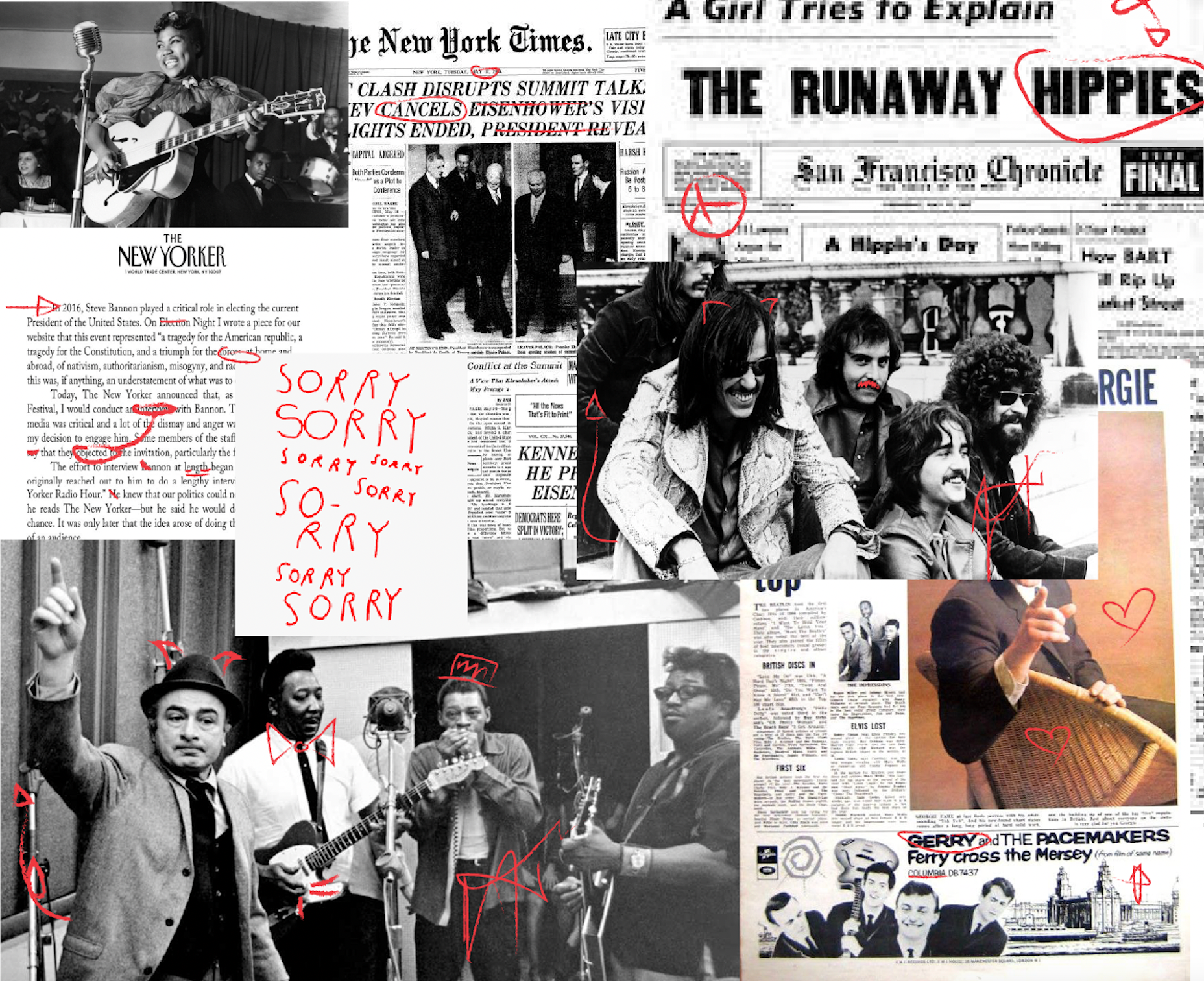
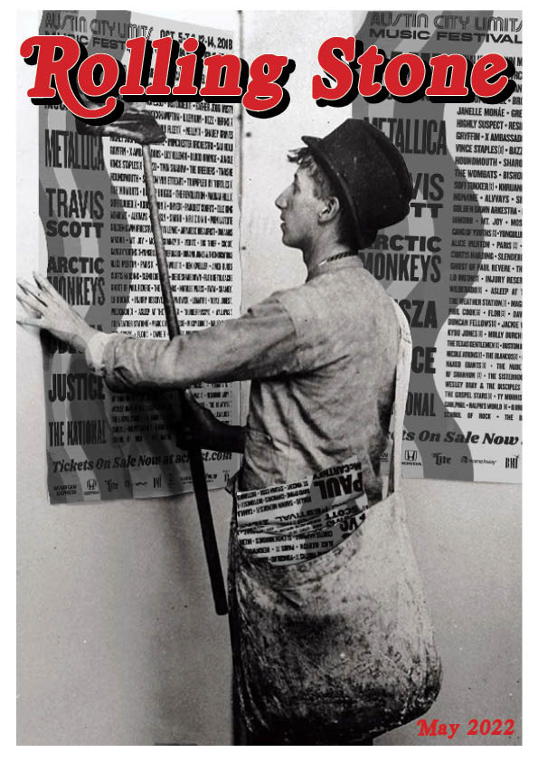
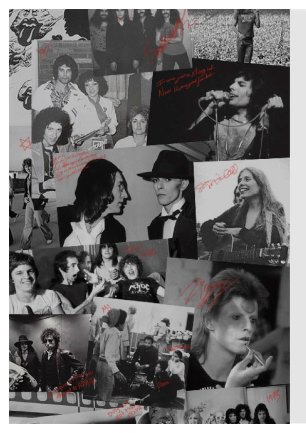
Although this was my first project, I keep it as a reminder of how much I’ve grown and where my ideas began. In early ideation, I started with a mood board and a few different color palettes. I was fixated on the idea of annotation, both in magazines and in songwriting. I loved the idea of marking up photos and memories with red pen. I finalized my moodboard and color palette, based on that idea.


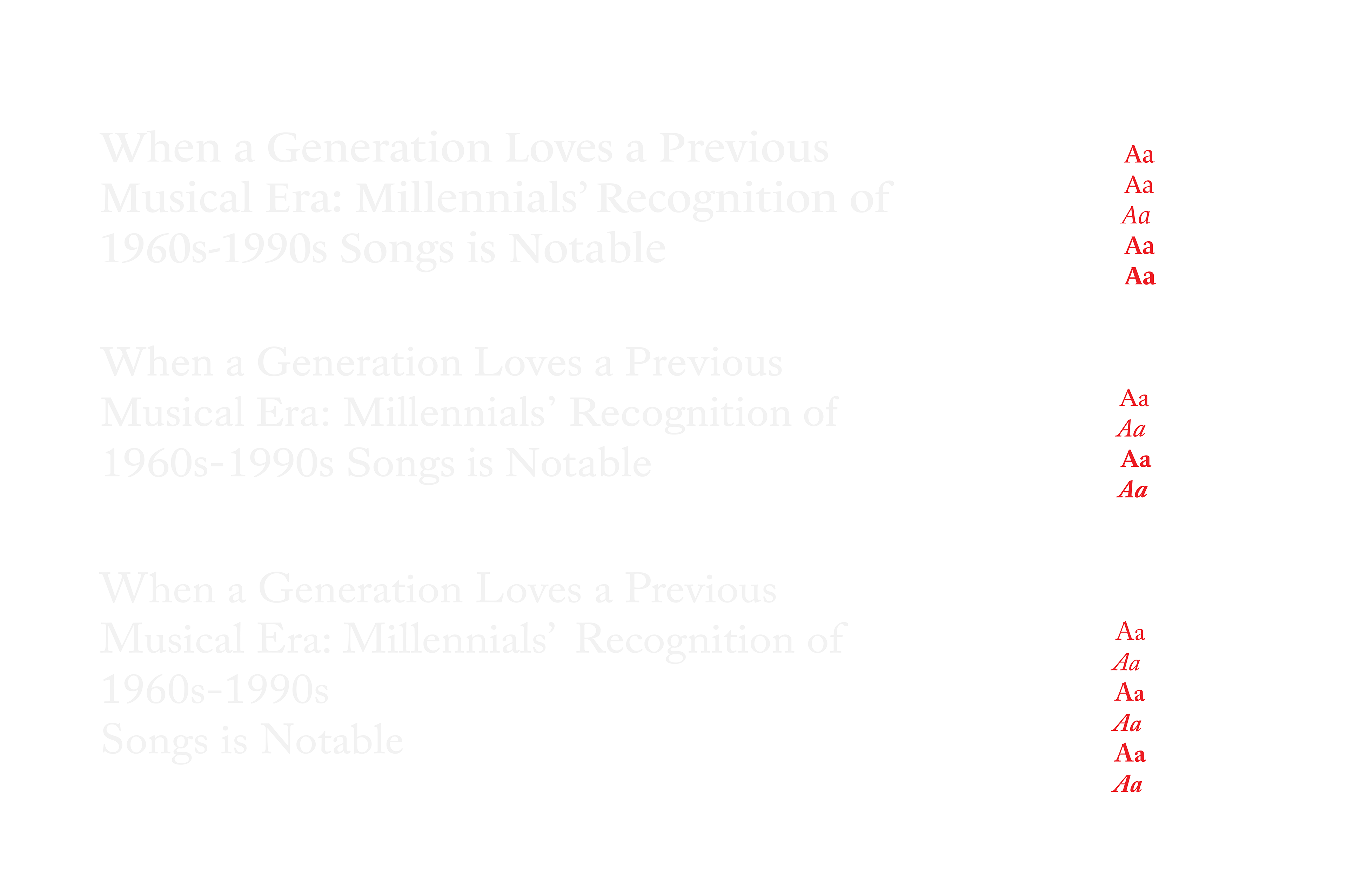
From there, I started my first investigation into type. I was surprised by how much I loved this process and I narrowed it down to three typefaces.
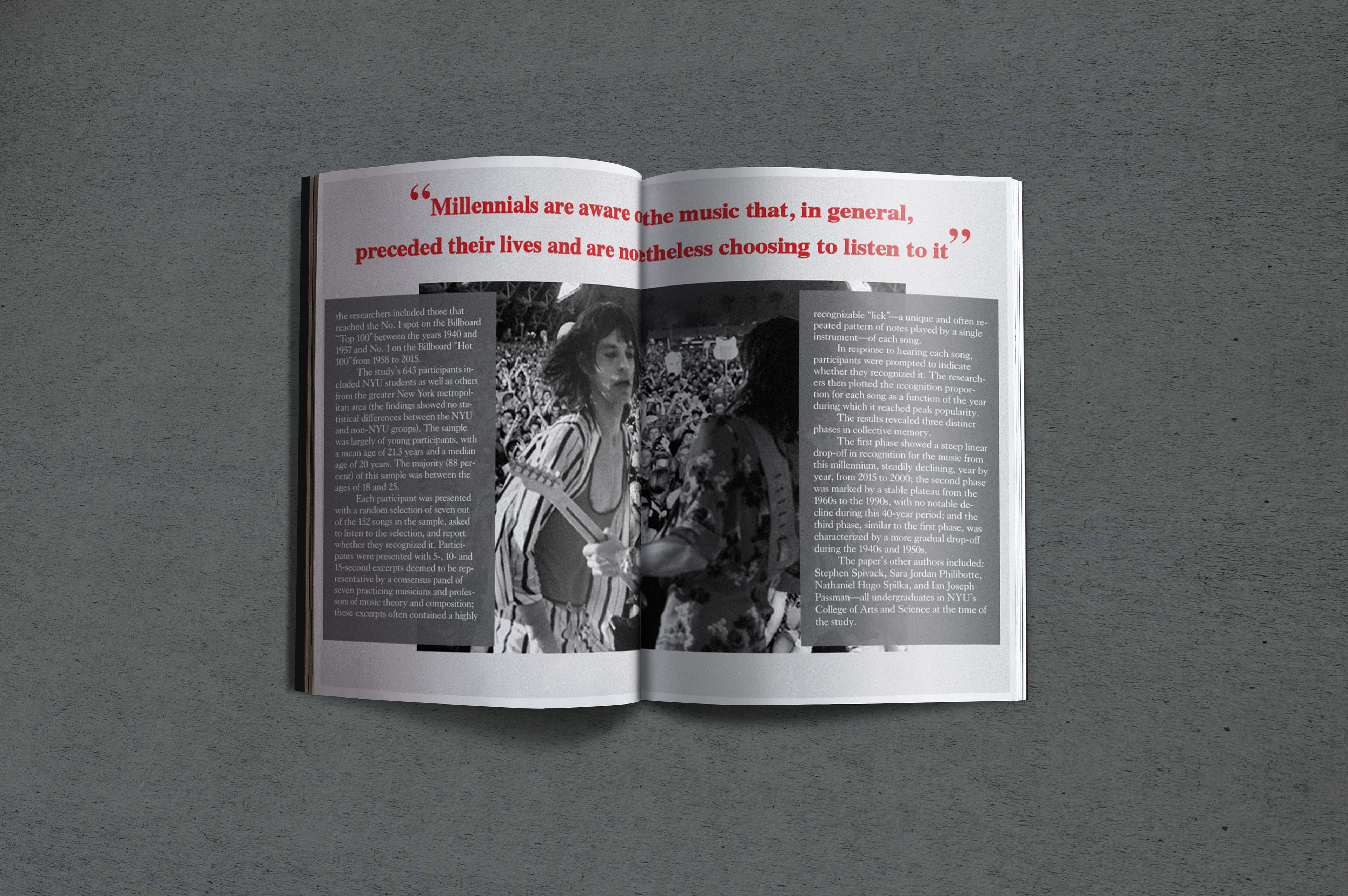
Using all these elements, I created spreads with the feeling of personal annotation as well as a theme of blending new music with a legacy brand.
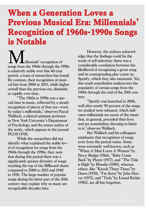

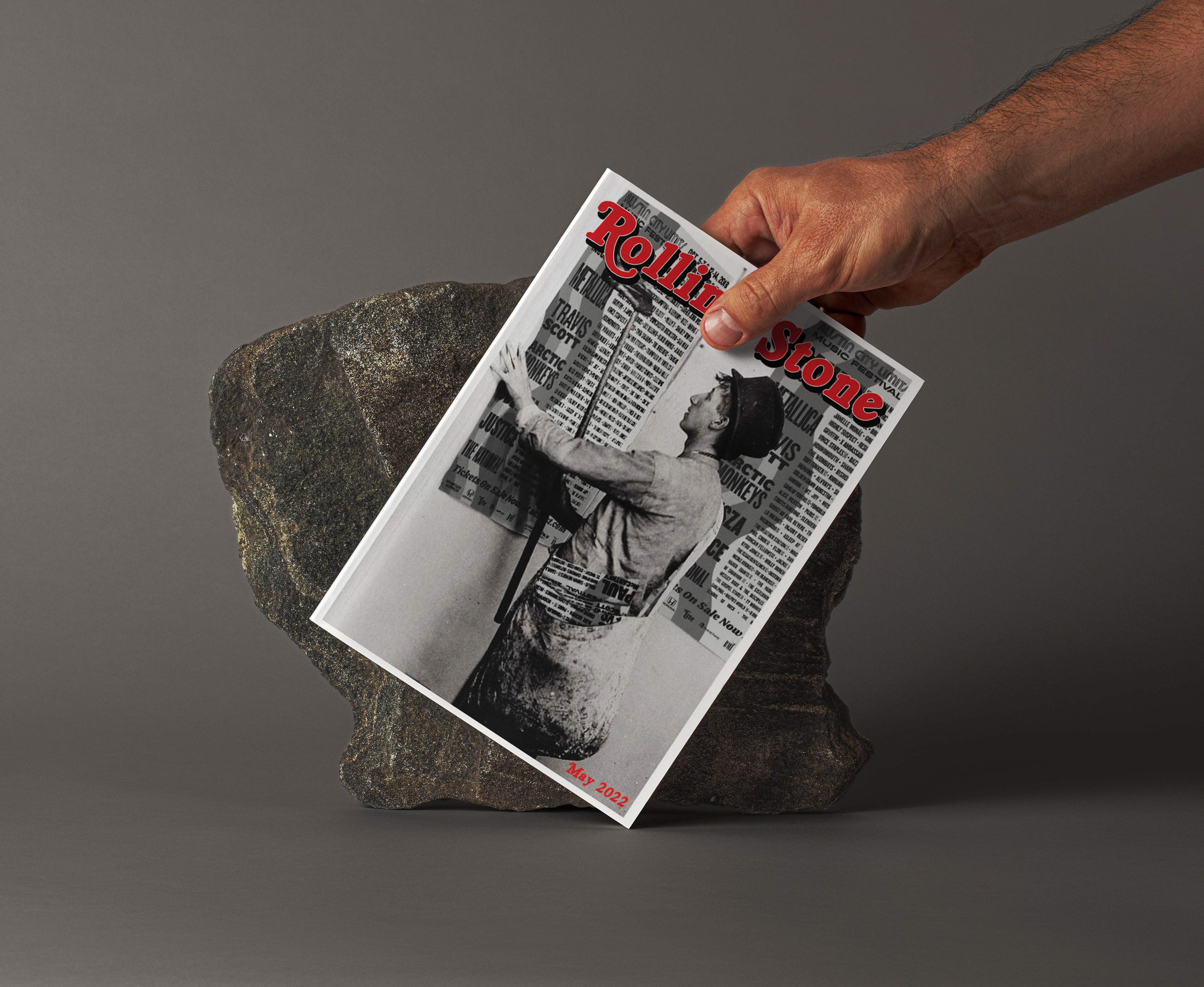
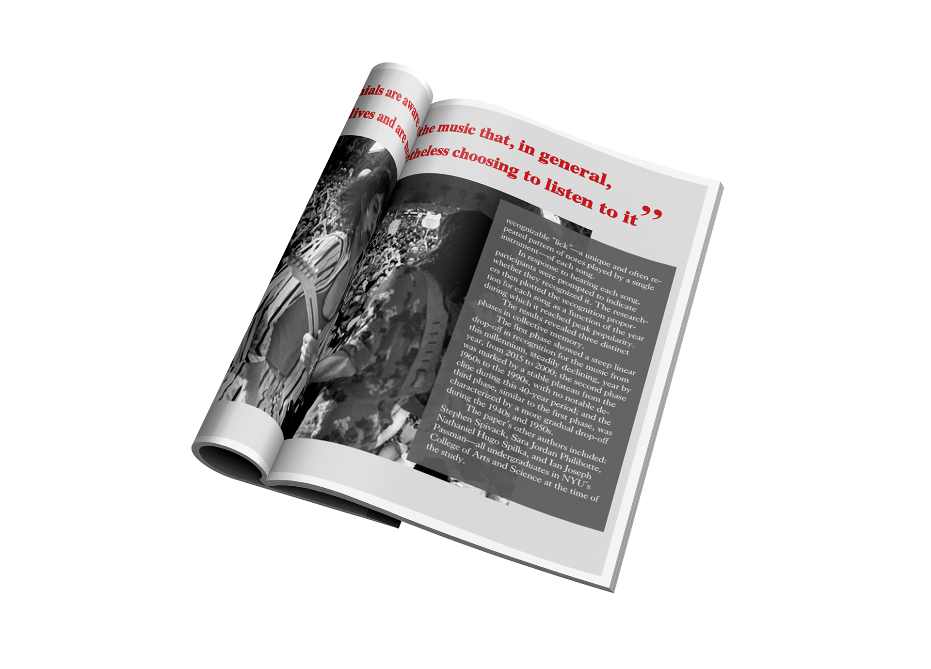
Finally, I created my first mockups to get a feel for how the spreads would look when they hit the presses.